
An organization chart visually displays a company’s structure, showing relationships between team members, departments, and hierarchy. Google Sheets is a handy tool for creating this chart, and it’s easy to follow along.
Why Is an Organizational Cart Important?
An organizational chart is important because it shows everyone who’s who and who does what in a company in a way that’s easy to understand. It’s like a map that helps everyone from the top to the bottom understand their jobs, who they need to talk to, and how work flows through the company.
This makes things run smoother, helps everyone get along better, and ensures all the work gets done right. For people just starting their jobs, it’s like a quick guide to figure out the team and feel part of the company faster.
It’s also convenient for planning—whether for the work we do now or for growing the team later on. Whether the company is big or small, having this chart is a must-have.
Step 1: Open Google Sheets
Go to your browser, type in sheets.google.com, and press Enter. Click on the blank spreadsheet to start fresh.

Step 2: Enter Your Data
Start by deciding the structure of your organization. Typically, you require the employee’s name and who they report to.

Step 3: Insert Chart
Once your data is ready, highlight everything you’ve entered. Click “Insert” from the top menu, then hover over “Chart.”

In the side menu that appears, switch to the “Chart type” dropdown and scroll until you find “Organizational Chart.” Click on it to select it. Google Sheets will automatically generate an organization chart based on the data you provide.

Step 4: Customize Your Chart
Once your chart is created, you might want to adjust its appearance. Click on the chart, and you’ll see three dots in the upper right corner. Clicking this will open a menu that allows you to edit the chart, including changing colors or adjusting the size of boxes. Use these options to customize your chart to fit your organization’s look or to make it clearer.

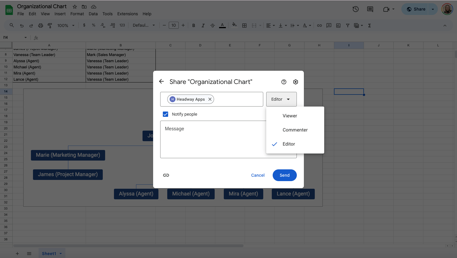
Once you’re happy with your organization chart, you can share it easily. Click on the “Share” button in the upper right corner of Google Sheets. You can then enter the email addresses of individuals you want to share the document with or create a shareable link that you can distribute.
Get the Free Organizational Chart Template
Get a copy of the free Organizational Chat template. I’ve populated the cells as examples but you can customize them as needed.
Final Thoughts
Following these easy steps allows you to create, customize, and share your organization chart with anyone who needs to see the big picture of your team or organization. If you’re working on a reorganization, bringing new employees on board, or just want a simple visual reference, a Google Sheets organization chart is a super handy tool to have.
Frequently Asked Questions
Can I customize the appearance of my organizational chart in Google Sheets?
Once the chart is created, you can customize its look by clicking on the chart and accessing the customization options. You can adjust color, size, and text format to match your preferences or organizational branding.
Can I use formulas to manage my organizational chart data in Google Sheets?
Yes, you can use formulas like SORT() and VLOOKUP() to organize and manage your data. However, these formulas are unnecessary when creating the chart as Google Sheets can automatically generate the structure from your data entries.
The Bottom Line:
One keeps you awake. The other gets work done.
A month of coffee: $80
A month of FileDrop: $19
Why not have both?


