
Ever felt like your work process is all over the place? A SIPOC diagram can help you get things organized. It’s a simple chart that helps you see how your process works from start to finish. And the best part? You can make one easily using Google Sheets.
What Is a SIPOC Diagram?
A SIPOC diagram is a simple tool that helps you understand the key parts of any process. The name SIPOC stands for Suppliers, Inputs, Process, Outputs, and Customers.
Think of it as a high-level snapshot that shows where things come from, what you do with them, and who benefits from the final result.
Whether you’re working on a project, improving a system, or just trying to make sense of how work gets done, a SIPOC diagram helps you see the full picture without getting lost in the tiny details.
Step 1: Open a New Google Sheet
Start fresh by heading to Google Sheets. Click Blank to open a new spreadsheet. Give it a name at the top, maybe something like “SIPOC Diagram – Project XYZ.”

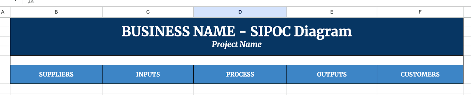
Step 2: Set Up Your Table
Your SIPOC diagram is basically a table with five columns. Here’s how to lay it out:
- Suppliers
- Inputs
- Process
- Outputs
- Customers
This is your SIPOC header row.
Step 3: Adjust the Columns
It helps to make your table easy to read. Here’s a quick way to tidy things up. Hover between the letters at the top of the columns (A, B, C, etc.). When you see the double-sided arrow, drag to make the columns wider. You can also select the header row (Row 1) and make the text bold for a nice touch.

Step 4: Fill in the Details
Now comes the fun part, describing your process. Go one column at a time.
Here’s a simple breakdown:
- Suppliers – Who provides what you need?
- Inputs – What do you need to start the process?
- Process – What are the key steps?
- Outputs – What do you produce at the end?
- Customers – Who receives the result?
Start filling in your information following these examples.

Step 5: Make It Look Good
A clean chart is easier to use. Here are a few quick tricks. Highlight the whole table and click Format > Alternating colors for a striped effect. Use borders around your table from the toolbar to make the lines clearer. Choose a calm font like Arial or Verdana for a simple, readable look.

Once you’ve finished your SIPOC diagram, you can easily share it with your team. Just click the green Share button in the top right, add email addresses, and decide if they can view or edit.

Get the Free SIPOC Diagram Template
Get a copy of the free SIPOC Diagram Template. I’ve populated some cells as examples, but you can customize them as needed.
Final Thoughts
Sometimes the hardest part of improving anything, whether it’s a work process or a personal project, is just getting it out of your head and onto something you can see. Don’t overthink the details. Start messy if you have to.
The goal isn’t to create a perfect diagram; it’s to give yourself and others a clear, honest look at how things work.
Frequently Asked Questions
When should I use a SIPOC diagram?
A SIPOC diagram is helpful when you’re starting a new project, improving a current process, or trying to figure out where things are getting stuck. It gives you a big-picture view, which makes it easier to spot problems and find solutions.
Do I need to use formulas in my SIPOC diagram?
Not really. A basic SIPOC diagram is more about organizing information in a table than doing calculations. Most of the time, you’re just entering text into each section. But if you want to add things like counts or summaries, simple formulas like =COUNTA() can help you track entries.
Can I link data from other sheets into my SIPOC diagram?
Yes! If you want your SIPOC diagram to automatically pull updates from another sheet, you can use formulas like =IMPORTRANGE() or basic cell references like =’Sheet2′!A1. This works well if your inputs or outputs are tracked elsewhere.
The Bottom Line:
One keeps you awake. The other gets work done.
A month of coffee: $80
A month of FileDrop: $19
Why not have both?


