Tracking supplier performance can save you time, money, and frustration. A supplier scorecard helps you measure important factors like delivery time, quality, pricing, and customer service. The good news? You don’t need expensive software—you can create an effective scorecard using Google Sheets.
What Is a Supplier Scorecard and Why Is It Important?
A supplier scorecard is a simple way to track and evaluate how well your suppliers are performing. It looks at key areas like quality, delivery time, cost, and customer service.
Having a scorecard helps you make sure you’re working with reliable suppliers, keeping your supply chain running smoothly, and spotting any areas that need improvement. By regularly checking in on supplier performance, you can make smarter decisions and build stronger business relationships.
Step 1: Open a New Google Sheet
Open Google Sheets and start a new blank spreadsheet. Rename the sheet (click “Untitled spreadsheet” at the top) to something like “Supplier Scorecard.”

Step 2: Set Up Your Header Row
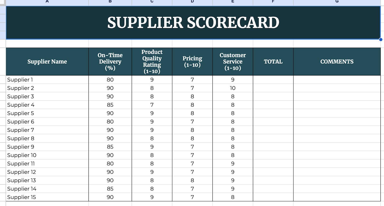
In the first row, label the key columns that will help track supplier performance. Some common categories include:
- Supplier Name
- On-Time Delivery (%)
- Product Quality Rating (1-10)
- Pricing Score (1-10)
- Customer Service Score (1-10)
- Total Score
- Comments
These columns will allow you to evaluate and compare suppliers effectively.

Step 3: Enter Supplier Information
Start adding your suppliers’ names in the first column. Then, for each supplier, enter their performance data based on your records or evaluations.
For example, if a supplier delivers on time 95% of the time, you can enter ‘95’ under ‘On-Time Delivery (%)’. If they provide high-quality products, you might give them a ‘9’ under ‘Product Quality Rating.’

Step 4: Calculate the Total Score
To make scoring easier, use a simple formula to total up each supplier’s score. If you are using a 10-point scale for each category, your formula in the ‘Total Score’ column might look like this:
=SUM(C2:E2)
This formula adds up the scores from the ‘Product Quality,’ ‘Pricing,’ and ‘Customer Service’ columns for the first supplier. Drag the formula down to apply it to all rows.

Step 5: Use Conditional Formatting for Easy Comparison
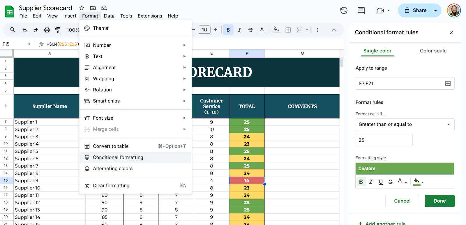
To make it visually clear which suppliers are excelling and which need improvement, use conditional formatting. Select the ‘Total Score’ column. Click on ‘Format’ > ‘Conditional formatting.’
Set rules like: Green for scores above 25 (great performance), Yellow for scores between 15-25 (average performance), Red for scores below 15 (poor performance). This makes it easier to see trends at a glance.

Google Sheets lets your team collaborate in real time. Click the Share button (top-right) to add editors or viewers. Set up monthly reminders to update scores based on new orders or feedback.

Get the Free Supplier Scorecard Template
Get a copy of the free Supplier Scorecard Template. I’ve populated some cells as examples, but you can customize them as needed.
Final Thoughts
Using Google Sheets for a supplier scorecard is simple, effective, and budget-friendly. With just a few formulas and formatting tricks, you can keep track of supplier performance and make data-driven decisions for your business.
Frequently Asked Questions
How can I automate score updates?
You can use Google Sheets’ ARRAYFORMULA to automatically apply calculations to an entire column. Additionally, linking data from other spreadsheets can help keep scores updated in real time.
How do I track changes over time?
To track performance over time, create a new column for each review period and compare previous scores using trend analysis charts or conditional formatting.
How do I make my scorecard more visual?
Use charts and graphs to display trends, conditional formatting for color-coded insights, and pivot tables to summarize key performance data.


